![]()
What is R?
R is programming language and execution platform for statistical computing and graphics. It is known to be the successor for the S language, which was developed at Bell Laboratory. It focuses on a wide variety of statistical and graphical techniques, including linear and nonlinear modelling, time series analysis, statistical tests, classification, clustering, … and on and on. One of the major differences between S and R, is that R is open source and free.
It is designed to be a language that non computer scientist can take full advantage of its capability and focus on data manipulation, calculation, and graphical display. The powerful data type and calculation on arrays, vector, and matrices makes it very convenience for data analysis.
How to graph with R?
In this article, I will focus on the graphical capability that is available out of the box from R. This is meant to be a simple introduction and hopefully will show you how simple it is to start your own data analysis and visualization with R.
Graphing with R Examples:
Let’s consider a use case where we are analyzing the types of transportation that people prefer to ride on. Let’s start with cars.
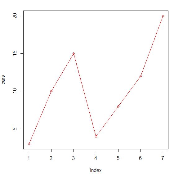
# Let's say we have 7 values for cars, each representing a day in a week, we will use a vector to represent that
cars <- c(3,10,15,4,8,12,20)

# Next, let's graph it
plot(cars)
This is the result you will see

Pretty cool right, only 2 lines of code.
# Next, let's add a line to connect the dots and draw it in red color
Plot(cars, type="o", col="red")
By adding additional attributes to the plot command, this is what you will get
# Now, lets add another type of transportation, trains
trains <- c(5,3,10,7,9,3,8)

# To create a graph with both data, we need to calculate the range for them
g_range <- range(0, cars, trains)

# we will now plot cars first, and customizing the axis to our liking
plot (cars, type="o", col="red", ylim=g_range, axes=FALSE, ann=FALSE)
axis(1, at=1:7, lab=c("Sun","Mon","Tue","Wed","Thu","Fri","Sat"))
axis(2, las=1, at=4*0:g_range[2])
box()

# we can now add on the line for trains
lines(trains, type="o", pch=22, lty=2, col="blue")

# title and legend as well
title(main="Transportation", col.main="grey", font.main=4, xlab="Days", ylab="Total")
legend(1, g_range[2], c("cars","trains"), cex=0.8, col=c("red","blue"), pch=21:22, lty=1:2)
By now, the graph is looking a bit more interesting, and pretty cool !
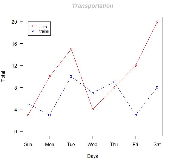
So here it is, a simple demonstration on how to write a few lines of code using R, and produce an analysis graph.
In case if you are interested, I use R-Studio to run and test this example. You can download the R platform from https://cran.r-project.org/, and R studio from https://www.rstudio.com/, both are open source and free.